Thursday, May 3, 2012

Sunday, April 29, 2012

Art Event #2 : Pam Cardwell talk


     I thought that the talk given by visiting artist Pam Cardwell was interesting on several fronts. I really liked how she explained her process as working like a writer or novelist in that she starts her works with lots of details, from whatever source she is working from, and then begins to refine them and abstract them. I also thought her talk was interesting in that she explained her interest in the work of Gorky and how she was first exposed to his work when on a field trip when she was very young. Cardwell then explained how she taught and lived in Turkey from 1998-2004, during that time she traveled in Armenia and Georgia where she looked at Armenian illuminated manuscripts and monasteries. She elaborated on what she loved most about these sites by describing how she looked to the frescoes in Georgian churches by loving the “massive scale and vibrant colors” and the faded images from the churches.
     Perhaps the first point that I picked up on, and I saw realized in the drawings she did while visiting SMCM, was her idea that she works like a “novelist.” In that she will work from imagery seen in the environment around her and her first sketches will be more “realistic” and then she will go back into her drawings with an eraser and charcoal and rearrange and rework her drawings until they were abstracted forms of the original. I feel like this idea is exactly the same mindset as what I am working with in my current project. When I say that I am referring to how my current work involves taking preexisting documents and slowly making alterations and additions to the document to remake them in a fashion that seems more “real” in accordance to my own vision. So, in a way I find that my own working process is in line with what Cardwell described in her talk simply by coincidence of a similar mindset/practice while working.
     Finally, what I think is working strongly in Cardwell’s work is that her drawings and paintings really do appear as these unique, natural “things” that your eyes have never seen before, yet also have some familiarity behind them. Looking at these images does allow the mind to start forming some connections – perhaps because I did see her studio when she was visiting, it is easy for my own mind to draw connections between these works and various natural formations (beaches, rocks, etc) and natural organisms, such as plant life. I also though that her explanation of her working process – taking in as much information as possible and then slowly letting some of it go – made her work much stronger and more relatable, as I could better understand how her mind was working through these artistic situations.


Monday, April 23, 2012

Intention Statement


     The world around me is a thing that is changing so drastically that it has become nearly impossible for me to understand what is around me. It is constantly pushing its own signs and messages onto me and nothing is sticking. To attack this lack of understanding the world around me and its contents my own form of art has developed. My pieces look to reanalyze, reinterpret and recreate forms from these outside, worldly forces and make a record of them as they would exist in my own conscious understanding of the environment that is surrounding me. Images and figures and documents are no longer static, calculating and unreadable, but are fluid and vivid and contain all the passion and deep-felt emotion that they originally had before being passed down from one supposed source to another. The works are aiming to remake history into a completely emotional and visual arena that is just as absurd and beautiful as it supposedly already is.  

Wednesday, April 11, 2012

Project Three Research - Adolph Gottlieb


Blast I, 1957


     As I continue to grow interested in developing my own form of visual writing, another artist that I look to for inspiration is the later work of Adolph Gottlieb. Now on one hand I do find Gottlieb’s earlier work – his pictographs – interesting because of how he filled them with “universal symbols” of his own creation (theartstory.com). I took this to mean that he was interested in interpreting the grand and overlaying stories/concepts of the world in his own form of visualization. To that end I am very much interested in his work, such his painting, Man Looking at Woman. This type of painting is also interesting to me because it is done in such a primitive style that it looks as if it could be interpreted by any group of people, however, because Gottlieb put his own imagery into the biomorphic forms, the work becomes more personal.
     However, as my own writings become more visual in nature and plays off of the surrounding images and text that I am looking to “reinterpret” I find Gottlieb’s latter, Burst paintings to be more within the mood and look of what I am trying to create with my own work. For example, in his painting Blast I (1957), Gottlieb uses huge strokes of paint and color to establish a mood for the piece and for the viewer to experience, all without any discernable, direct imagery (Wilkin 16). With these paintings, Gottlieb focuses solely on color and form, which I find myself more and more interested in; line and shape as portraying a mood or feeling, as opposed to directly spelling something out for the viewer to feel. However, I do think it is interesting that Gottlieb’s paintings really exist on their own, there is no real background or backing imagery, which is very different then how I want to create my next works, which are based solely on a preexisting text, which will serve as the basis for my works. So it will be important for myself, as I progress with this work, to understand that there must be a balance between the marks that I make, their relationship to each other and the relationship to the original document.


Man Looking at Woman


Sources:

theartstory.com

Wilkin, Karen. Color as Field: American Painting 1950-1975. New Haven: Yale University Press, 2007. Print.


Project Three Research - Helen Frankenthaler


Mountains and Sea


     I have only recently become drawn to the work of Frankenthaler after have seen one of her paintings in person. What strikes me is that even though her work falls into the category of “Color Field” painting, the work is still very graphic in the way that the paint is dripped and poured onto the canvas; and in some areas I could almost see her painting form into symbols or words, which I found very appealing to my own artistic mindset.
     What I found really amazing after seeing her work in person was how her images/compositions really seemed to “emerge” from the canvas itself in a way that looked completely natural and believable (theartstory.com). Her works to do not seem like something that was obviously layered and fussed over by the artist, instead the imagery seems to come from within and extend out in all directions and at the same time, “…The figure and ground become one” and any trace of 3D illusionism is completely removed (theartstory.com). After reading this, I could look at her famous painting, Mountains and Sea, and have a better feel as to what she was going for, because at first look I thought the painting was just a total mess- nothing really made sense to me. Now, however, after better understanding the practice behind her works, the imagery seems much more powerful and fitting in with the technique used to make it.
     Yet it is also interesting to my own artistic mind that Frankenthaler was interested in the “ambiguities of symmetry.” In fact when describing her own pieces, Nude and Eden, Frankenthaler stated that there is a balance between what is “enclosed and what is seeing out of an enclosure” (Brown 45). Frankenthaler elaborated by saying that in regards to her work, she was interested in something being symmetrical and not at the same time – each side of the work being different, yet still balancing out the whole composition. 
     I think this is why I am now starting to appreciate Frankenthaler’s work as some form of inspiration for my own projects. Just as her stain paintings seemed to emerge from the canvas itself, I want my drawings/writings to not seem to be layered on top of some background or source image. To be truly effective as a drawing and as writing the work should look to have been originated from its background. So for this final project I need to pay close attention to my backing image/documents because if I start to make marks that do not agree with the original, then the whole piece will come across very badly. I think though if I work to layer, shade and make my marks in a variety of ways then my works will seem as organic and wide-spreading as Frankenthaler’s are.


Sources:

theartstory.com

Frankenthaler, Helen. Interview by Julia Brown. After Mountains and Sea: Frankenthaler 1956-1959. 
New York City: Harry N. Abrams, 1998. 27-49. Print.


Monday, April 9, 2012

Project Three - Initial Sketches


 My initial thoughts going into this project are to bring back my evolving, hand writing/drawings. However, this time, instead of adding my writings onto images (which I saw as a way to re-describe those images) I want to reinterpret historical/political/military documents with my writings directly on top of these documents. I want my writing to have a sporadic, child-like manner that works to show how I see these types of historical/political documents - as these items of a world in which there is this clean, presentable world on the outside (what the public sees), but these documents really represent the desires and wants of these mysterious, cult-like organizations and governments. Basically, I want to again illustrate my uncomfortableness with the world of politics by bringing these documents into my own world.

Thursday, March 29, 2012

Projection Images


Project Two - Self Assessment

      For myself, this project was an evolution of my art practice on two separate levels. Of course one of the driving factors behind this piece was wanting to expand my comfort zone into a new medium/dimension; wanting to put some distance between myself and the need for my projects and works to be a physical “thing.” The idea of my work being a “projection” was always a scary idea to me as I always assumed that the work would be more based around the computer and the technology behind the art then the ideas or finished product. So this projection was absolutely a way to “test the waters” of a zone of art that I had never thought that I would work with.
     The other factor/ driving force behind this piece was a desire to continue with the ideas and content that I had developed in another project/class (Sculpture Studio). In that sculpture project I developed and handed out business cards and posted flyers around campus with the saying, “I can’t breathe when you sleep,” and I really enjoyed how so many people saw and reacted to the work. Honestly, by the end of that project I felt that the work could have continued on in multiple directions. This wanting to continue the dialogue that I established with the school community really led me to seeing that a projection would be the next logical step in the evolution/expansion of this “idea.”
     So by wanting to continue with this statement and the dialogues/conversations that it sparked, I realized that the piece would need to still be very much in the same vein as the flyers and cards that preceded it. Namely I am talking about how both the cards and flyers were hand-written; from the outset I knew that the projected version of the statement would also have to be hand-written if I wanted it to have the same emotional and personal weight to it. The nature of this work being hand-written allowed me to feel more comfortable with the computer programs that I was using in the creation process – as I felt that I was “looking at myself” when working with the programs instead of some complicated menus or formulas. Also, I felt that the hand written statement allows for the viewer-artist/work relationship to be formed as the nature of hand writing creates a much more personal connection on any level.
     Honestly, the biggest surprise that I came across during the development of this project was how comfortable I was with the whole process and how fairly seamless the development process was. Obviously there was a “break in period” in which I had to learn the basic nature behind the programs I was using (Motion and Final Cut Pro) but after that the whole project really started walking on its own. The projection started off as having the statement scroll across the screen/projection surface, but the idea was quickly replaced by the idea of having the words being written out for the viewer to follow along with. This writing-out of the words added another level to this existing piece as it invited the viewer to witness its “creation” – in other words, the viewer was no longer being handed a card with writing on it (a prefabricated tool), but they were instead seeing my hand write out the very same message in “real time,” which I think makes the statement seem even more personal and direct.
     The next piece of the project was to have the statement repeat itself when it was projected. When I say that I am referring to how the writing out of the words would happen multiple times during the projection, causing the once clear statement to become muddled and almost illegible. I feel like this aspect of the project gives a little more “activity” to the piece and the site in which it is located and it also keeps the viewer more engaged with the work, as they are unsure as to what might happen next. I feel that through all of these steps within the creation of this project I really learned that I should trust and buy into the nature of handwriting; all of the aspects of these piece revolve around writing a message, nothing really seems out of place in this writing context (that spelling-out and the overlapping of the writing) and because of this I feel the work is more cohesive. I feel that if I had tried to use color or fancy animation then the power behind the work would be lost and the viewer would be focusing on these gimmicks instead of being confronted and affected by the message that was waiting for them.
     In retrospect I feel that my work habits were successful in the fact that I had to learn how to use two new-to-me computer programs and become comfortable with how they were affecting the content that I wanted to present. For future projects I would absolutely want to spend more time understanding what these programs are capable of in terms of content and possible final products, as I feel that this project used them for fairly simple means, but by no means does that suggest that my project was “simple” or easy to create. I just feel that if I know more about Final Cut or about projectors then I could use this knowledge to project even bigger and more complicated statements/content.
     Since I have been so invested in this project, in all of it’s forms, and since it has received such diverse reactions from viewers/participants I have a little trouble in imagining how I would respond to it from the viewer’s perspective. However, I would feel that since the message is appearing and disappearing before my eyes I would feel a strong sense that the writing was there for me to see and contemplate and the statement’s repetition/overlapping would only add to the feeling of directness and personal connection. Also, since the piece is so simple in it’s presentation (only words are appearing on a brick wall) I would feel that there is not that much to be distracted or confused by (although the message itself may appear to be confusing). I think this is where some viewers will become put off or unsure of the piece’s effectiveness – what exactly does the message mean? – but at this point in time I think this uncertainty is exactly what is need for the piece to spark dialogues between viewers and with myself, which was exactly my intention from the beginning of this statement’s origin. So I think the cryptic-ness is effective for this piece and it also relates to my own interests in creating my own evolving, abstract “hyper-language” – maybe projecting my own writing-drawings would be the next step for a future projection.
     Finally, I feel that I deserve an A- for this project because I was strongly committed to the project at hand and worked hard to make sure that the final piece was potent and engaging with the audience. I feel that this piece is an excellent example of how I can continue to evolve and work with content I have worked with before and still retain interest in the concept while presenting it in new ways. This project has only added to the possibilities of my interest in written works in all mediums.

Saturday, March 10, 2012

Artist Talk: Martin Brief

Artforum Series, scale photo

What I liked so much about the lecture given by Martin Brief was that he was so honest and direct with the audience. Of course he began his talk by telling us a little about himself – born and raised in Chicago and got his Masters in photography – but he then began to relate to the audience by asking aloud, “What do these people want to know?” of course with that question he was referring to us and he answered that question be diving into and explaining the impetus and process behind several of his text-based works/projects. His honest explanations gave the audience a better understanding of his body of work and, honestly, made me feel even more interested in text-based work as a whole.
     One of the projects that Brief discussed that I found really interesting was his ongoing Newspaper Series. What really struck me about this project was hope relatively simple it was in theory – Brief would fill in all of the lower-case letter “o’s” on the front page of the New York Times. He established a limitation on this project by only using issues that were release on or after the date of his birth up until the present and he said that the project will end when he selects the issue that corresponds to his own birthday. What was so powerful to me about this work was that he was simplifying such a complex thing (the constantly changing front page and the language on the page) into these small, identical marks. I also thought that the process of the work was something I could relate to as the project, and all of his others, was very process based, as he was constantly working in the same manner and I have just been working on two sculptures that had very heavy process-based elements in them; in other words, I felt like I could relate to these Newspaper works.

August 6th, 1969

     The one main thing that I love about Brief’s work is how seemingly simple his ideas and processes are, but in a way his pieces are much more powerful and open to discussion because of it. I would never thought it possible to take Jenny Holzer’s Truisms and blow them up by writing out each definition of each word in the Truism. By doing so Brief doesn’t answer any questions or critique Holzer, but he presents the information in a different, more backwards way. The only thing that I think is somewhat weak (but I can’t help but like at the same time) is how each project/piece is fully explained in relation to its process. I feel like this almost does all the work for the viewer, however it does set the viewer up to more easily navigate the work, so I am not sure if this is a very large weakness. Its more just like another detail in the huge lists of words and names that Brief has organized for us to see.

Untitled No. 238, Truisms (After JH) Series

Thursday, March 1, 2012

Using Flash

I have made a simple test version of my sentence in flash, which is nice to see it in some form of animation,  I just do not know how to display it on this blog. But let everyone know that I am working with Flash!

Project Two: Sketches

Below are some Photoshoped images of the site I would like to use for the projection project. The images were taken during the day, but I will take some night photos soon, and I was uncertain about moving anyone's bike for these photos as these are more for just a reference of what I would like the project to resemble - this handwritten message displayed for people to see on the retain wall by the campus center fountain.


The handwritten aspect is something that I absolutely want in this piece - but I am pretty open/unsure if the message should be in a single row or broken up or should it move around. I just don't really have a concrete desire right now except for it being handwritten and it being this exact message.

Monday, February 27, 2012

Project Two Research - Barbara Kruger

Your Silence is My Comfort, 1981

     Similarly to Jenny Holzer, I find myself incredibly drawn to the text and image based work of Barbara Kruger. I find her work to be in a similar vein to Holzer’s in that the combination of image and text works to confront the viewer by directly addressing them and pointing out aspects of their own lives and society in general. Since her first collages in the late 70’s, Kruger’s works have provided political, social and feminist critiques and commentaries on a huge range of topics including: religion, sex, racial and gender stereotypes, consumerism, greed and power (Art History Archive). Many times her pieces play of the interaction of the reading viewer by using personal pronouns that, “implicates viewers by confronting any clear notion of who is speaking” (Art History Archive). Her work is, in my opinion, visually unnerving in the way that it speaks directly to those who read them; statements like, “Your body is a battleground,” “Your comfort is my silence” and “Thinking of you” when combined with striking, almost dream or nightmare-like imagery may seem distant at first, but they slowly creep into the mind of the viewer until they feel as if the work has been specifically meant to be read by themselves.
     The earliest beginnings of Kruger’s work can be traced back to her time at Syracuse University in 1964 where she began to develop an interest in graphic design, poetry, and writing before transferring to Parson’s School of Design in 1965 (Art History Archive). It was here that she was introduced to fashion and fashion magazine subcultures and after only a year of school she left and began to work at different fashion and art magazines, serving as a designer and art director (AHA). However, by the late 70’s she had begun her collage work using found images from “Mid-century American” print media sources and collaged words on top. By the early 80’s her collages had become large-scale black and white photos juxtaposed with “raucous, pithy and ironic aphorisms always set in the Futura Bold typeface against black, white or deep red text bars (AHA). I think that this sense of continuity, or similarity, between the vastly different subject matters, in terms of the look of each work adds to the sense of a collective or whole voice in the collection of Kruger’s work.
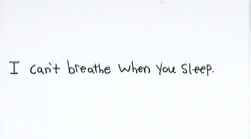
     Another thing that I find myself drawn to about these images, and something that I find relates in a way to my own work, is the tone of voice in all of Kruger’s work. In my work my visual writing is vague and cryptic, leaving anything open to viewer interpretation – it could be a command from the gods or the writing of a crazy person. However, what is different about Kruger’s text, and what I like so much about it is that her voice is “angry and accusatory” but at the same time she leaves the voice in the text and the intended audience a mystery (Friedman 461-462). For example, in her piece, Your Comfort is My Silence (1981), there is absolutely no clue as to who has said this or as to why, but the viewer is struck by just how demanding and direct the voice is and the backing image of a person’s face only adds to the frightening power. There is no room for the viewer to think that the message is not intended for them – they are implicated and witness to the message the second they come into contact with the work. A work like this one and the majority of Kruger’s work is playing off of he look and layouts of the fashion magazines she once worked at; her works look like they could be advertising, but in reality are disputing the very same ideas that society and those magazines are trying to sell.

 Temporary Stedlijik Gallery Installation, Amsterdam, 2010


In addition to her individual pieces, I think that Kruger’s more recent installation work adds even more to the visual textual assault on the viewer by literally surrounding them with text in the gallery space. In this installation in Amsterdam, the viewer is engulfed and surrounded by text that is directly addressing them and their certainties about the world around them. In this context the viewer can not escape from be addressed and is even more a witness to the messages the artist is imparting to them and in the case of these large gallery installations, “The floor has a voice, walls can hear you, and the architecture is manipulating the way you speak” (AHA).
     I feel that Barbara Kruger’s work is so strong because she is so confident and direct. If she was coy or shy in the way she addressed and included the viewer in her collages, they whole body of work would seem much less serious and potent. However, I feel that because Kruger does not directly call out a specific individual as the speaker or receiver, there is still a powerful vagueness that allows the images to be dispersed and ingested on a massive scale, just like the advertisements and societal ideas that she is critiquing through her work.

Temporary Stedlijik Gallery Installation, Amsterdam, 2010


Works Cited:

"Barbara Kruger." The Art History Archive. N.p., n.d. Web. 27 Feb. 2012.
     http://www.arthistoryarchive.com/arthistory/feminist/Barbara-Kruger.html.

Fineberg, Jonathan. Art Since 1940. Upper Saddle River: Prentice Hall, 2011. Print.


Images:

http://karaj.tumblr.com/post/4260877510/earlyfrost-revolutionnow-aliceinborderland

http://www.thecitrusreport.com/2010/headlines/barbara-krugers-“past-present-future”-the-temporary-stedlijik-in-amsterdam/


Project Two Research - Jenny Holzer

Jenny Holzer, Protect Me From What I Want


     I find that I am constantly drawn to work of any kind that uses the written word. There is a direct, human quality (as we are the only currently known species to communicate with written symbols), while still retaining some air of mystery behind its creation and intention. Because of these thoughts, I was immediately interested in the text-based work of Jenny Holzer. Holzer’s text work, which she calls “Truisms” stretch from detailing “common myths” to phrases about random subjects that take the form of slogans (designboom). Examples of this slogan-like quality, which in my opinion, adds to the mystery of what are these message’s intentions include: “Money creates taste,” “Enjoy yourself because you can’t change anything anyway,” and “Don’t place to much trust in experts.” These quick, thought-provoking statements mimic advertising in where they are placed – billboards, coffee mugs, commercials on cable/network TV – and they “…Question what our eyes can see and can’t see in the media” and end up questioning if we have any control over the information that is provided to us (designboom).
     Holzer began to work with text while she was earning her BFA at Ohio University, where she was studying painting and printmaking, but soon began to shift her interest to public art projects that were “sublime and impressive” (designboom). Her first Truisms were created in 1976 when she moved to New York City and posted them anonymously around the city. Since that time, Holzer’s Truisms have expanded their medium beyond just posters, including works on LED monitors that are posted in relation to monuments and memorials and since 1996 Holzer’s work has included large-scale, text projections on buildings and landscapes in a huge range of locations such as Rome, Oslo, Paris, Berlin, Miami and others (designboom).
     If the first thing that drew me to Holzer’s work is that she was working with text, the second thing that interested me was how different her work is from my own. In my own work I use text to expel these hidden workings and meanings behind everyday things and thereby add to my own evolving part-language, part-drawing and myths. However, I feel like Holzer’s work is working in a completely opposite field, while still being based in text. Her work portrays these somewhat familiar phrases that “displace the clear presence of a personal voice.” Holzer’s Truisms, “…Underscore the essential emptiness of the media and the strange isolation of people from one another in the society of mass culture clichés” (Fineberg 461). I really feel as if Holzer’s Truisms, whether they are posters or projections, are highly connected to the world around us and are working to change how we think about our surroundings while my own work is moving in the direction of reinterpreting everything under the sun.


     With these thoughts about the media and public interaction in mind, Holzer’s piece Protect Me From What I Want becomes much more powerful. The fact that this piece is displayed on an electronic billboard (among many other formats) contacts the public directly in the environment. The work does not require a gallery to help stage it’s meaning; the public is necessary for the work to implant its meaning into the viewer and since the work is in this form, it directly plays into and critiques the world of advertising and consumer society (designboom).
     The main thing that I think is working so well in Holzer’s Truisms and projections is the fact that there is no real “set up” for the works. When I say this I mean that the works confront the viewer though their shear size or guerrilla-like marketing and they look like they belong in the environment – an environment full of constantly changing advertisements. The works, through their almost familiar phrasing, triggers some kind of thought or emotional response from the viewer. I think that when the viewer knows that something is going on, but can’t quite put their finger on it, or realize that the work is referring to their own lives, the work is highly successful.

Jenny Holzer, Truism Series


Works Cited:

"Jenny Holzer." designboom. N.p., n.d. Web. 27 Feb. 2012.             http://www.designboom.com/contemporary/holzer.html.

Fineberg, Jonathan. Art Since 1940. Upper Saddle River: Prentice Hall, 2011. Print.

Images:

http://www.arthistoryarchive.com/arthistory/contemporary/Jenny-Holzer.html
http://www.designboom.com/contemporary/holzer.html
http://karaj.tumblr.com/post/17541491356/jenny-holzer-all-things-are-delicately