For myself, this project was an evolution of my art practice on two separate levels. Of course one of the driving factors behind this piece was wanting to expand my comfort zone into a new medium/dimension; wanting to put some distance between myself and the need for my projects and works to be a physical “thing.” The idea of my work being a “projection” was always a scary idea to me as I always assumed that the work would be more based around the computer and the technology behind the art then the ideas or finished product. So this projection was absolutely a way to “test the waters” of a zone of art that I had never thought that I would work with.
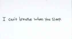
The other factor/ driving force behind this piece was a desire to continue with the ideas and content that I had developed in another project/class (Sculpture Studio). In that sculpture project I developed and handed out business cards and posted flyers around campus with the saying, “I can’t breathe when you sleep,” and I really enjoyed how so many people saw and reacted to the work. Honestly, by the end of that project I felt that the work could have continued on in multiple directions. This wanting to continue the dialogue that I established with the school community really led me to seeing that a projection would be the next logical step in the evolution/expansion of this “idea.”
So by wanting to continue with this statement and the dialogues/conversations that it sparked, I realized that the piece would need to still be very much in the same vein as the flyers and cards that preceded it. Namely I am talking about how both the cards and flyers were hand-written; from the outset I knew that the projected version of the statement would also have to be hand-written if I wanted it to have the same emotional and personal weight to it. The nature of this work being hand-written allowed me to feel more comfortable with the computer programs that I was using in the creation process – as I felt that I was “looking at myself” when working with the programs instead of some complicated menus or formulas. Also, I felt that the hand written statement allows for the viewer-artist/work relationship to be formed as the nature of hand writing creates a much more personal connection on any level.
Honestly, the biggest surprise that I came across during the development of this project was how comfortable I was with the whole process and how fairly seamless the development process was. Obviously there was a “break in period” in which I had to learn the basic nature behind the programs I was using (Motion and Final Cut Pro) but after that the whole project really started walking on its own. The projection started off as having the statement scroll across the screen/projection surface, but the idea was quickly replaced by the idea of having the words being written out for the viewer to follow along with. This writing-out of the words added another level to this existing piece as it invited the viewer to witness its “creation” – in other words, the viewer was no longer being handed a card with writing on it (a prefabricated tool), but they were instead seeing my hand write out the very same message in “real time,” which I think makes the statement seem even more personal and direct.
The next piece of the project was to have the statement repeat itself when it was projected. When I say that I am referring to how the writing out of the words would happen multiple times during the projection, causing the once clear statement to become muddled and almost illegible. I feel like this aspect of the project gives a little more “activity” to the piece and the site in which it is located and it also keeps the viewer more engaged with the work, as they are unsure as to what might happen next. I feel that through all of these steps within the creation of this project I really learned that I should trust and buy into the nature of handwriting; all of the aspects of these piece revolve around writing a message, nothing really seems out of place in this writing context (that spelling-out and the overlapping of the writing) and because of this I feel the work is more cohesive. I feel that if I had tried to use color or fancy animation then the power behind the work would be lost and the viewer would be focusing on these gimmicks instead of being confronted and affected by the message that was waiting for them.
In retrospect I feel that my work habits were successful in the fact that I had to learn how to use two new-to-me computer programs and become comfortable with how they were affecting the content that I wanted to present. For future projects I would absolutely want to spend more time understanding what these programs are capable of in terms of content and possible final products, as I feel that this project used them for fairly simple means, but by no means does that suggest that my project was “simple” or easy to create. I just feel that if I know more about Final Cut or about projectors then I could use this knowledge to project even bigger and more complicated statements/content.
Since I have been so invested in this project, in all of it’s forms, and since it has received such diverse reactions from viewers/participants I have a little trouble in imagining how I would respond to it from the viewer’s perspective. However, I would feel that since the message is appearing and disappearing before my eyes I would feel a strong sense that the writing was there for me to see and contemplate and the statement’s repetition/overlapping would only add to the feeling of directness and personal connection. Also, since the piece is so simple in it’s presentation (only words are appearing on a brick wall) I would feel that there is not that much to be distracted or confused by (although the message itself may appear to be confusing). I think this is where some viewers will become put off or unsure of the piece’s effectiveness – what exactly does the message mean? – but at this point in time I think this uncertainty is exactly what is need for the piece to spark dialogues between viewers and with myself, which was exactly my intention from the beginning of this statement’s origin. So I think the cryptic-ness is effective for this piece and it also relates to my own interests in creating my own evolving, abstract “hyper-language” – maybe projecting my own writing-drawings would be the next step for a future projection.
Finally, I feel that I deserve an A- for this project because I was strongly committed to the project at hand and worked hard to make sure that the final piece was potent and engaging with the audience. I feel that this piece is an excellent example of how I can continue to evolve and work with content I have worked with before and still retain interest in the concept while presenting it in new ways. This project has only added to the possibilities of my interest in written works in all mediums.